During my 2021 Fall Co-op experience, I worked with Aquisense Technologies, an environmental engineering company. I was asked to redesign their logo and then make a style guide that could be used to keep a consistent design for the rest of the company's documents and promotional materials.
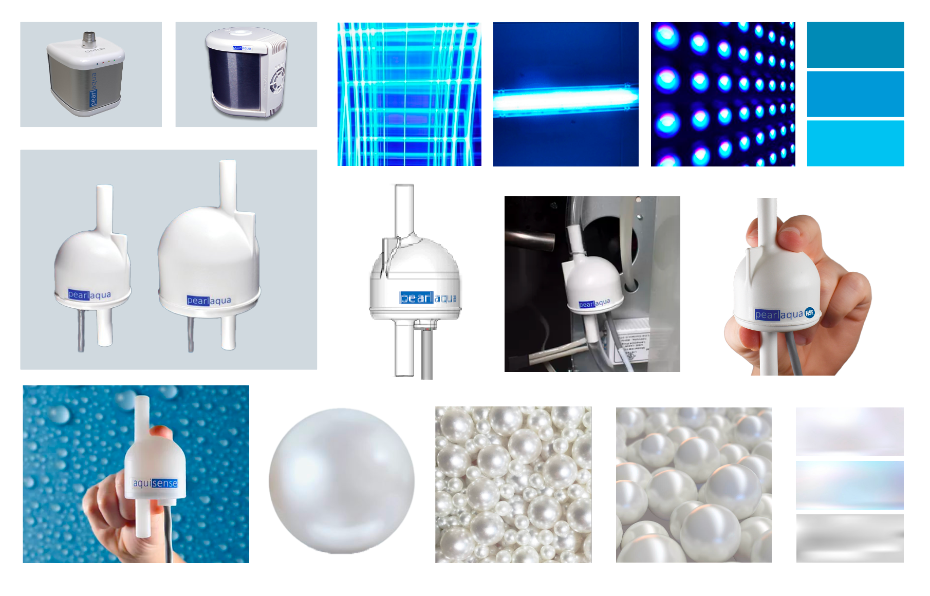
MOOD BOARD
LOGO ITERATIONS
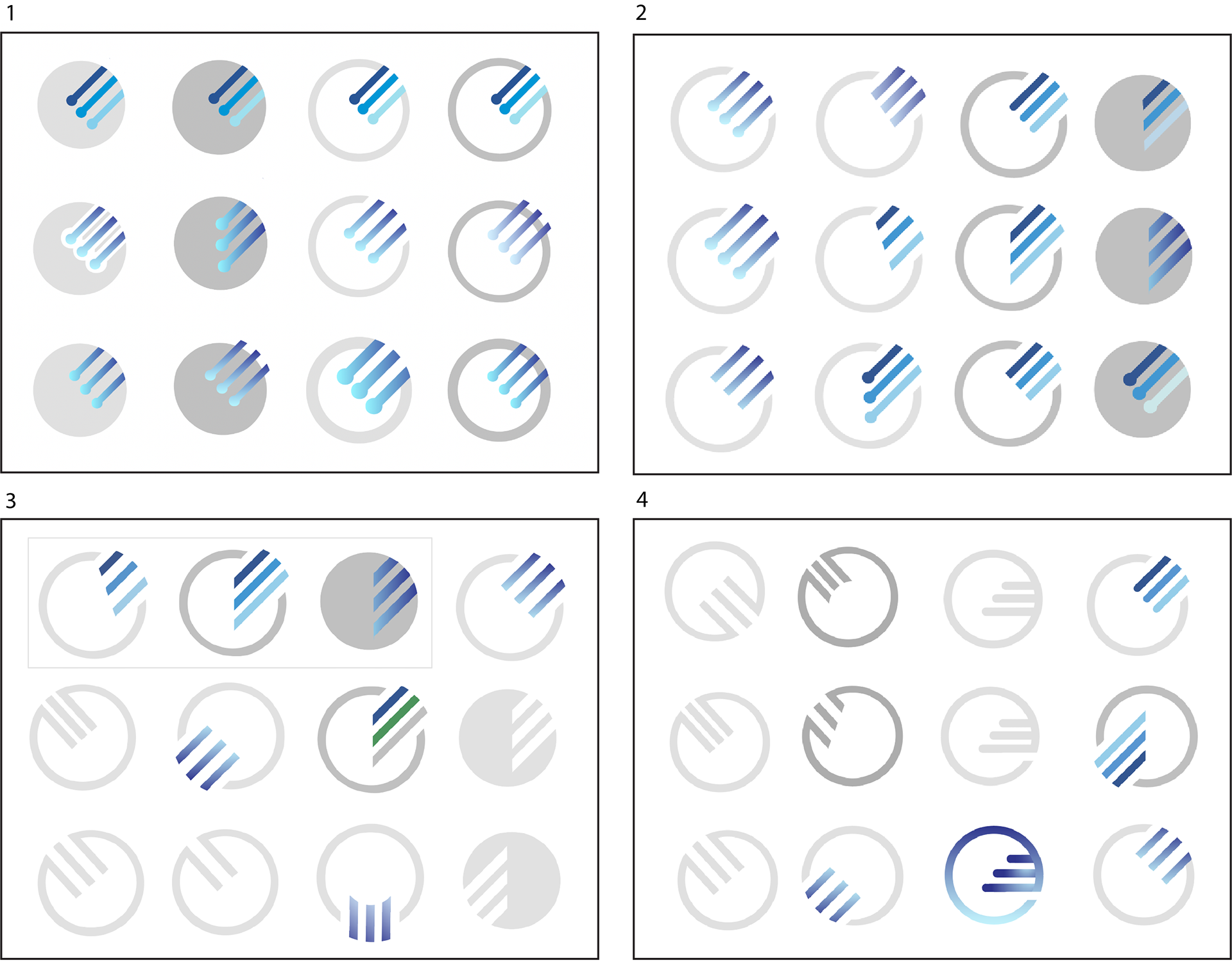
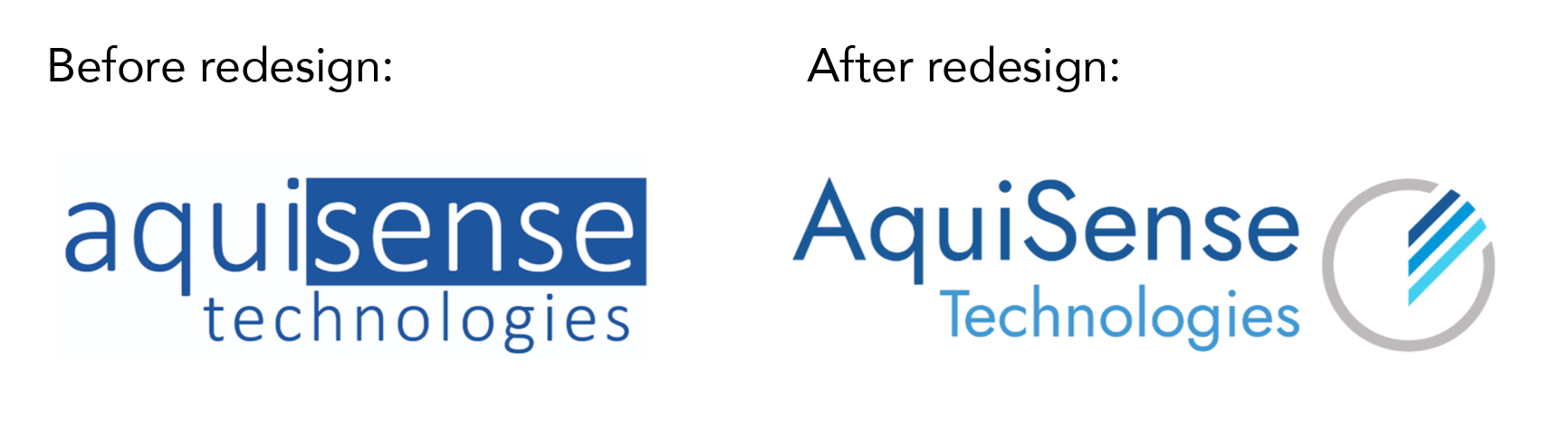
Above are the four stages of iterations I went through before deciding on a final design. The company asked that I use three diagonal lines as well as keep the colors of the original branding. I made sure to reflect their core values and beliefs in the design. Below is the final redesign of the logo. The three lines of blue symbolize water sanitization as it is cleaned, it also symbolizes LED light, which is used to sanitize. A new font was also chosen to reflect a clean, contemporary feel of the company.
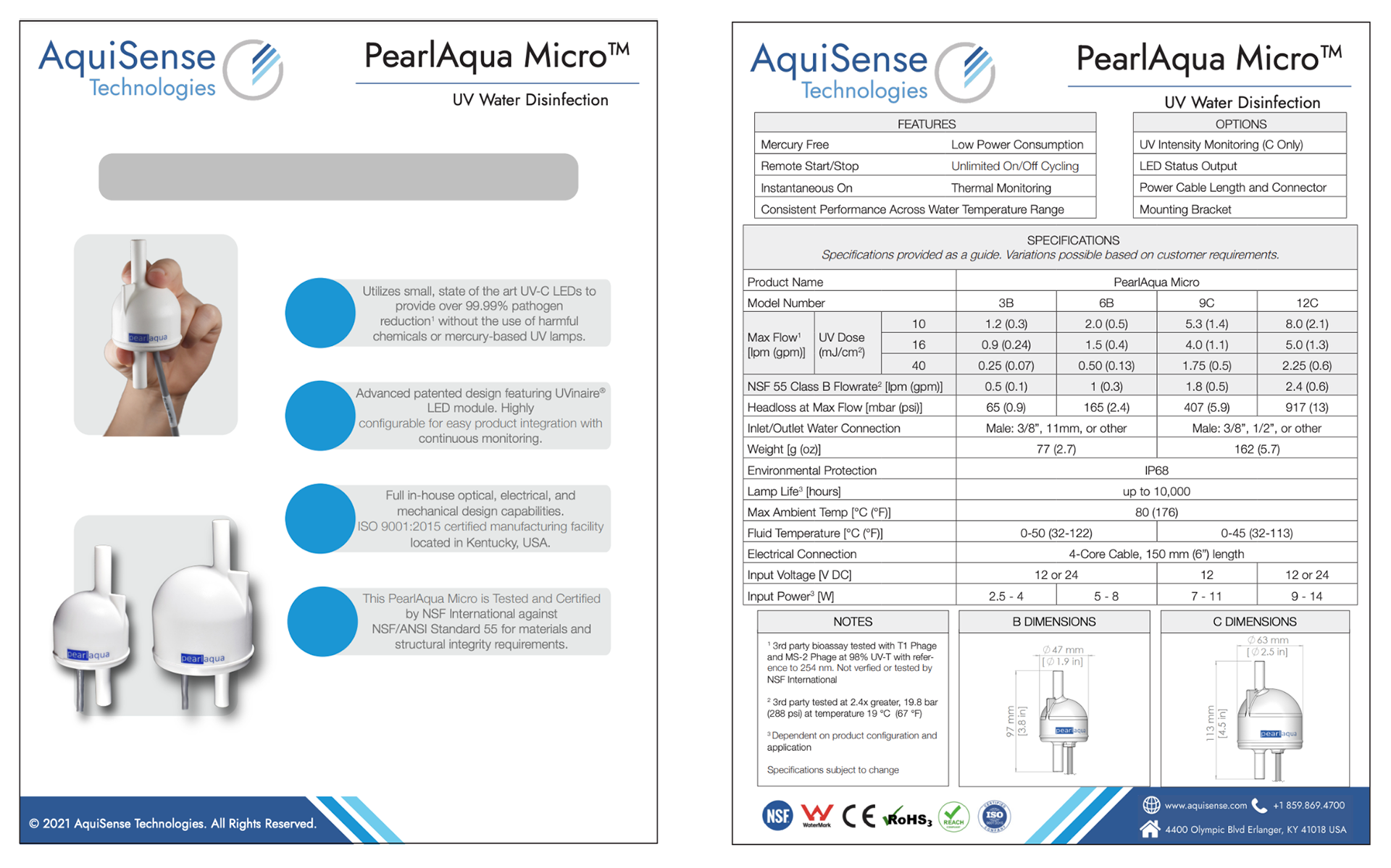
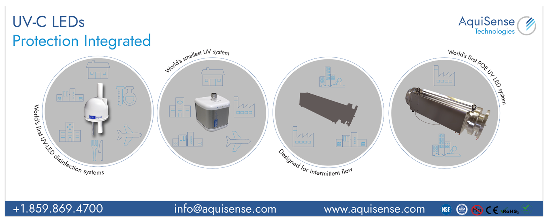
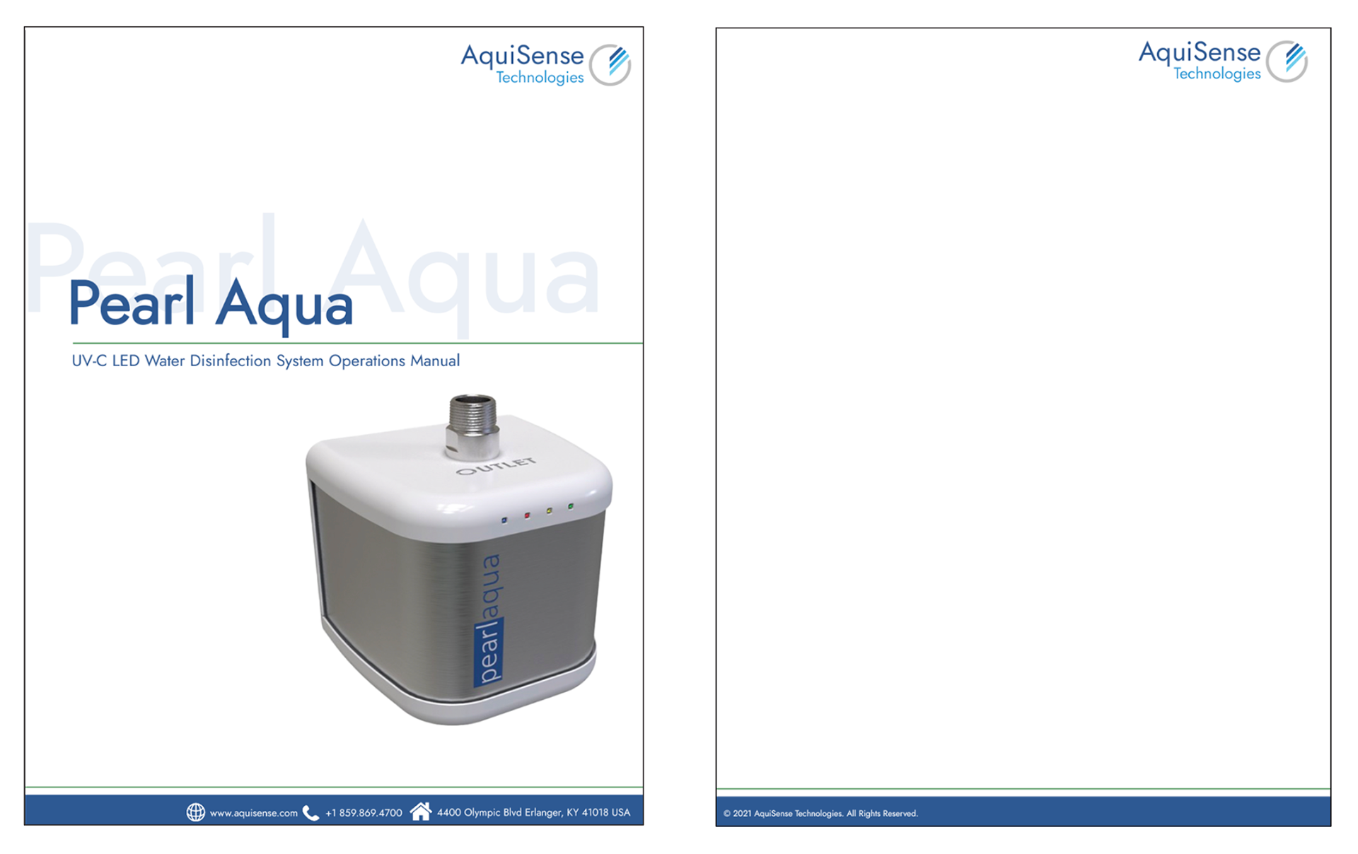
I then created a style guide to help ensure a consistent design throughout the identity of the brand. This style guide document was used to redesign company documents and promotional material for Aquisense Technologies. Below you will see a variety of documents I created for the company using the style guide. It was important to keep a coherent design within all the documents. I achieved this consistency by following the design rules we previously made for the brand.
Datasheet
Tradeshow Banner
Manual Cover
Letterhead
Working on this project has taught me a lot about the importance of design in a brand. Communication design plays a large role in portraying the image of a company to its audience. With good design, a company is able to clearly communicate its ideas and amplify credibility. This helps the company grab the attention of the public and increase sales and opportunities.